COLOR SPLENDOR / Day 4 -- PURPLE
 |
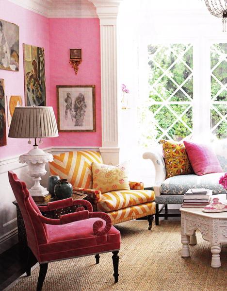
| imagecourtesysaucyhelplivejournal
Peeps,
Purple, the color most often associated with royalty, passion, or madness, is amazingly versatile in any decorating scheme. It works well when paired with white and all its pale cousins. Also fantastic with:
brown and black (anytime/anywhere); yellow (citrine/dandelion/golden-yellow/maize/mikado-yellow); green (apple-green/asparagus/cadmium/Dartmouth/olive/emerald/forest/Indian/Islamic/jade/ lime/Lincoln/Paris/pastel/pine/pistachio/sea/olive); orange (amber/apricot/cadmium/carrot/Princeton/pumpkin/safety/tangerine); pink (baby/bittersweet/blush/cotton-candy/cerise/coral/fuchsia/magenta/Persian/raspberry/ rose/wild-watermelon); blue (this for the bold among us, or extremely talented colorists on the order of: Jamie Duke, Kelly Wearstler, Mary Drysdale, and Anthony Baratta); red (again for the daring or desperate). Purple is the most perfect backdrop for displaying objects and furniture in shagreen, ivory, bone and shell, various stones, as well as gilded and painted; metallic finishes such as gold/silver/bronze/nickel/rust(?) all glow when placed against purple. Similarly, collections in wood, or items of crystal or glass sparkle when placed against purple/amethyst/Byzantine/lavender/lilac/magenta/maroon/mulberry/orchid/phlox/ruby. Positioned against purple, how visually striking are tribal objects, ancient statuary, antique prints, assorted antiquities, Old Master(s) paintings, and contemporary art. Whenever I hear a designer state that white/greige/off-white/egg-shell/sand and other assorted neutral colors or wall-coverings were chosen in order not to compete or distract from the art, I wince. Instead, how about: a. visiting art galleries and museums where art is expertly and creatively displayed in a variety of settings; b. touring estates, historic homes, and other residences of note where passionate collectors have successfully integrated art into interiors not devoid of rich, deep colors; c. enlist the services of a framer to re-frame and re-mat for a fresher look, as well as consult with a lighting designer to achieve optimum illumination; d. perhaps a knowledgeable curator or reputable art-dealer can assist with 'filling in the gaps' of the collection; and e. get out more often in order to experience the beauty of ART (against deep, rich colors). Trust me, good ART can hold its own; it has done so, and quite well, for centuries. Please enjoy today's visual treat, and thanks for all your recent emails. Sincerely, Shane |


Comments